★ Liked “Engineers Fix Original Defects in the Statue (of Liberty)”. From the 1985 archives.
‘’We just couldn’t buy her a new dress and dab on some new makeup. We had to fix her internal problems.’’

★ Liked “Engineers Fix Original Defects in the Statue (of Liberty)”. From the 1985 archives.
‘’We just couldn’t buy her a new dress and dab on some new makeup. We had to fix her internal problems.’’
★ Liked “A Spectre is Haunting Unicode”
To sum up - in 1978 a series of small mistakes created some characters out of nothing. The errors went undiscovered just long enough to be set in stone
I have observed that I have been more inclined recently to post on Blot blog. I do have my main website which I have been using for all things long and short. But there is some lure of the simplicity of this place. You write. You save. And the post is up.
No committing a post to a remote repository, waiting then for the engine to trigger a build. No frantic refreshes to check if the post is up. It’s simple.
But every time I saw my published post here, I was left cringing at how awful the interface around was. I wish I could purely focus on the content and the process. But unfortunately I am wired a bit odd. I tend to focus on the design around first; if that sucks, I can’t move on1.
So I had to take a pause today. If I was going to post more here, the place had to be cleaner.
And given that I already had my custom theme up, I got down to work. I refreshed the theme and made it all about content2.
No navigation items or links to other places - a link opens the content. And in just the way I like it.
No homepage summarising the place - /home opens the stream of my posts.
No distinguishing posts by type - all posts are equal3.
For now, I am happy with this design. At least, I won’t cringe when I open my own posts.
Why not make this the primary homepage? Well, I am still on the journey of indiewebifying this place. I still post to my site using other apps, mainly Quill and Micro.blog. Until I get the micropub endpoint that I am working on done, I will keep this place booked for my excursions, my experiments.
This is a costly habit. I can never signup for any service or an app that doesn’t have a good design and UI.↩
There’s no hiding, the design is heavily inspired by Brent Simmons weblog. I believe no shame in getting inspired by the best of the designers out there.↩
Eventually, I plan to separate at least the social posts (likes, replies, reposts) from the opinion and stories. But I am still not sold if I should.↩
Techmeme introduced a new form of ads today. This is how the homepage looked.
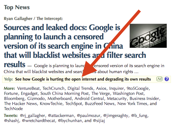
And this how they introduced the prominent change visible out there.
Today, Techmeme is introducing ads that are automatically placed under stories matching news topics that an advertiser wants to target. They’re a great way to associate your brand with a specific category of technology products, or even to challenge individual companies.
For instance, Yelp is now advertising against news about Google, to urge the search giant to “Focus on the User”.
To be frank, I don’t like this. Contextual advertising is overrated; it is prone to be misused by brands with power. Can a small upcoming player overcome an onslaught from the incumbents? It may be factual, but can be projected in an overly aggressive fashion.
Anyway, I think the wonderful folks behind Techmeme are aware of the possible fallouts. And they believe they have the process to avoid that.
Of course, there are limits to the sorts of messages we’ll place. We’ll decline to feature offensive or overly gimmicky ad copy. And we won’t include negative ad messages aimed at current advertisers, in effect, guaranteeing a form of competitive separation.
With the scale and scope of Techmeme, this might work, this might be enough. But I still believe it better not get into the muddy waters of contextual ads.
In line with the last update on Blot experiment, setting up webmentions. I think I will go with something simple to begin with.
★ Liked “The Bullshit Web”
An honest web is one in which the overwhelming majority of the code and assets downloaded to a user’s computer are used in a page’s visual presentation, with nearly all the remainder used to define the semantic structure and associated metadata on the page.
★ Liked “Doing Nothing”
Push your mind out of a rut.
This is important. I need to do this more often.
★ Liked “Dave Winer on the decrentralized web”
I think the “decentralized web” can’t be anything other than the web itself.
Back home after days of travel. It’s always great to be back at home, the “usual stuff” - usualities are welcome.

